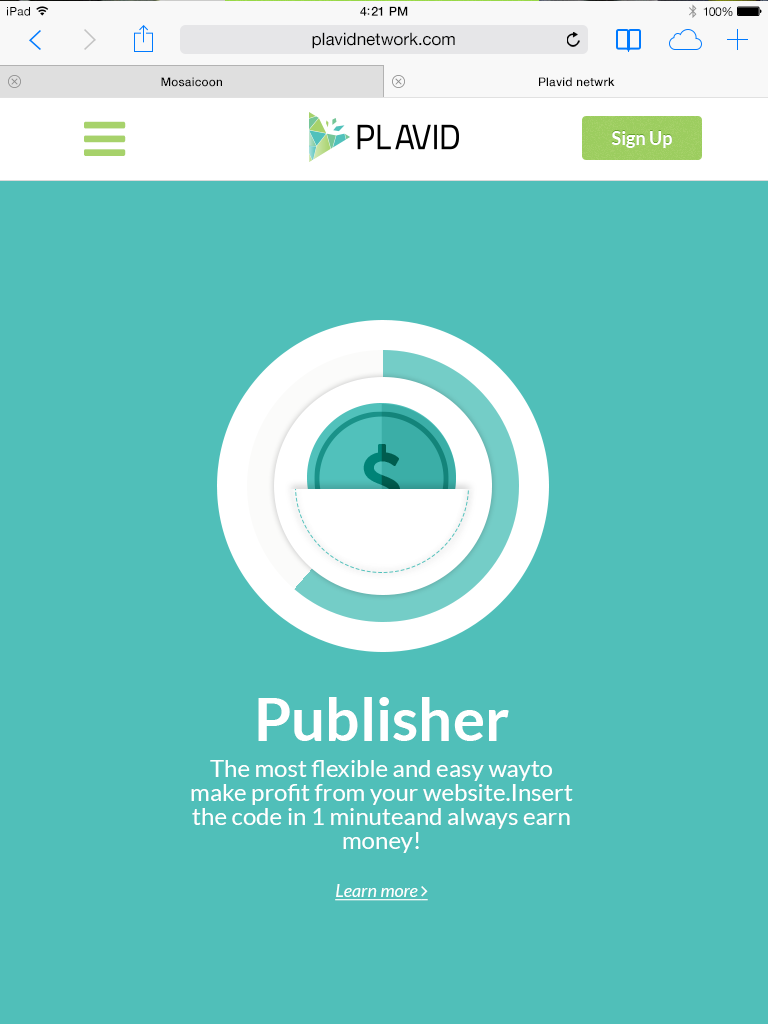
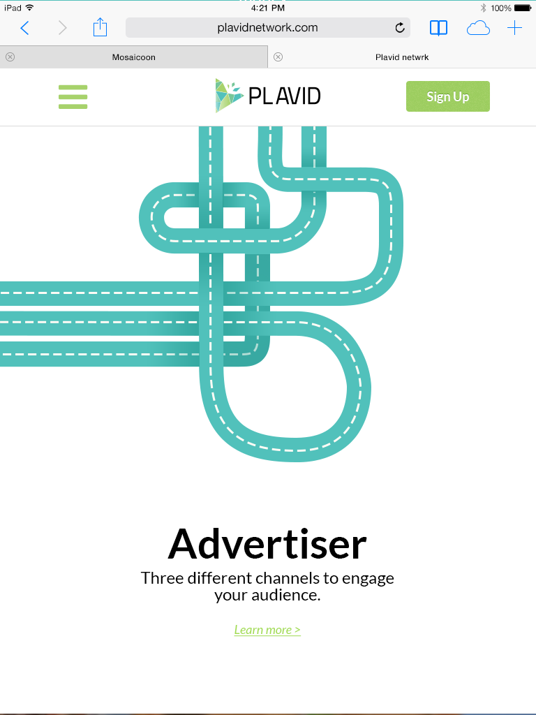
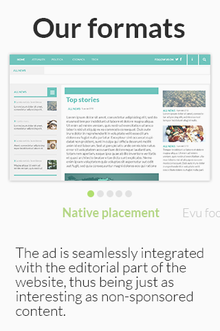
I have had the opportunity to work extensively for the plavid piataform. During these years I have been responsible for redoing the corporate site, creating newsletter templates, landing pages, product demos, guides, and social graphics.
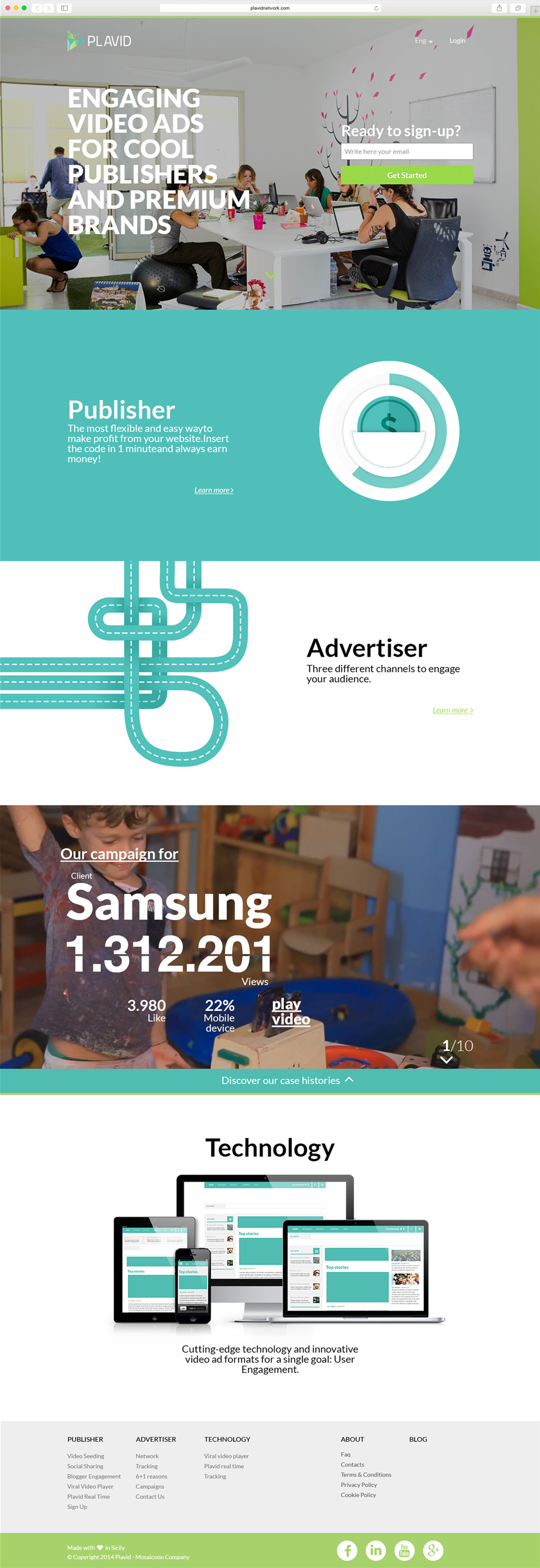
On this page you will see the work done on the website from research to visual.
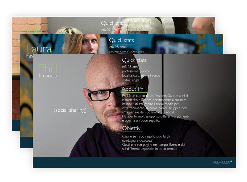
Personas
It was not possible for our team to interview target users due to tight timeframes and lack of resources, but it was possible to talk to internal stakeholders to trace useful information to define project personas.
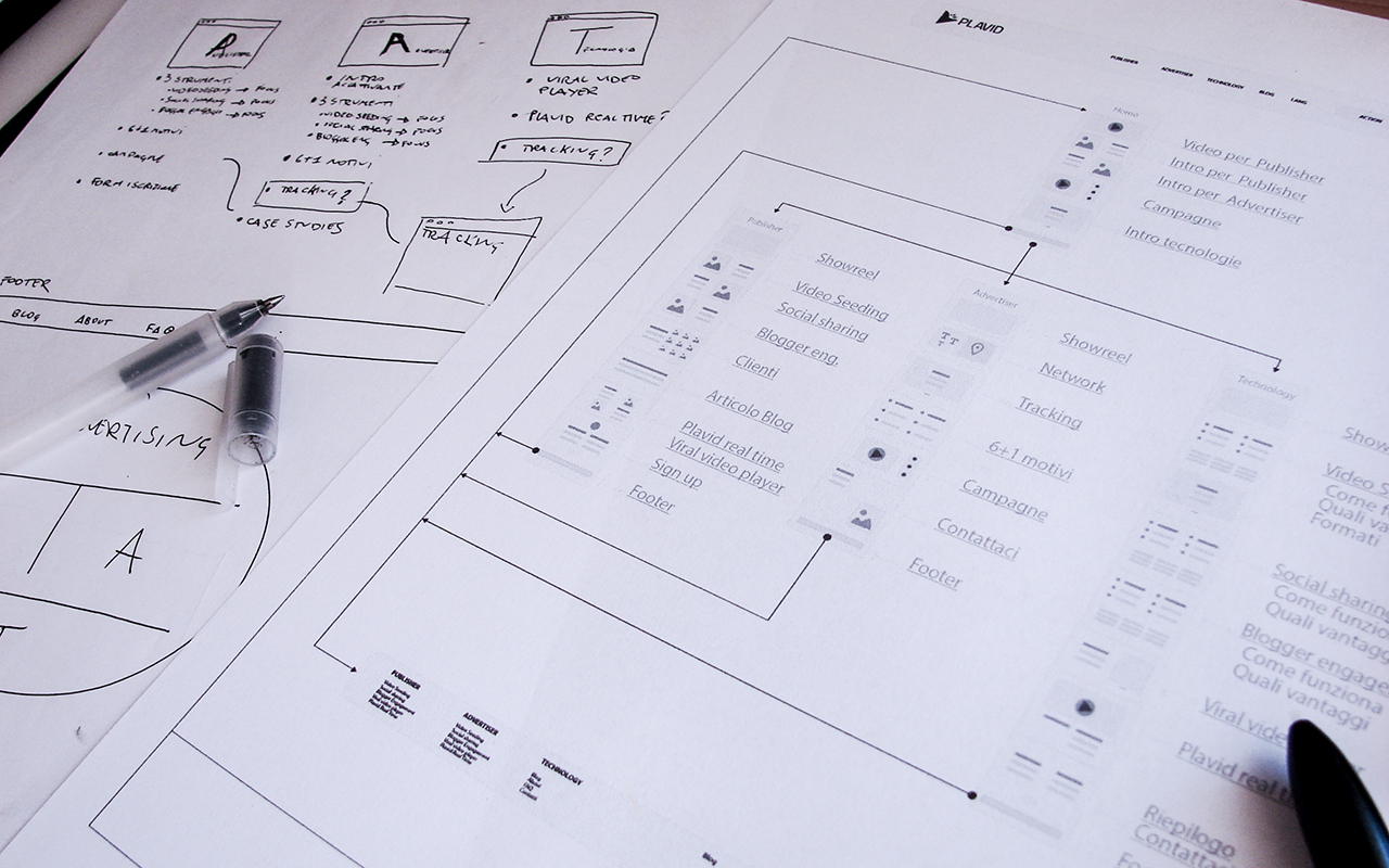
Information architecture
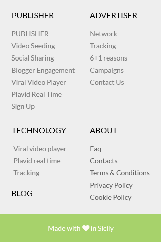
Starting with personas, an Audience based architecture was identified.
Following this strategy, two main pages were designed, one for publishers the other for advertisers. The remaining pages, of interest to the entire target audience, were intended to complete the information within the sign-up path.
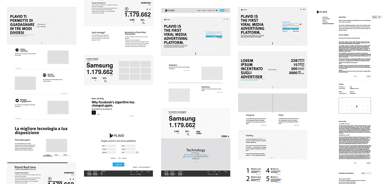
Wireframe
Once the strategy was outlined, it was easy to design the structure of the pages based on the information to be displayed and the information path for users to follow.
Moodboard
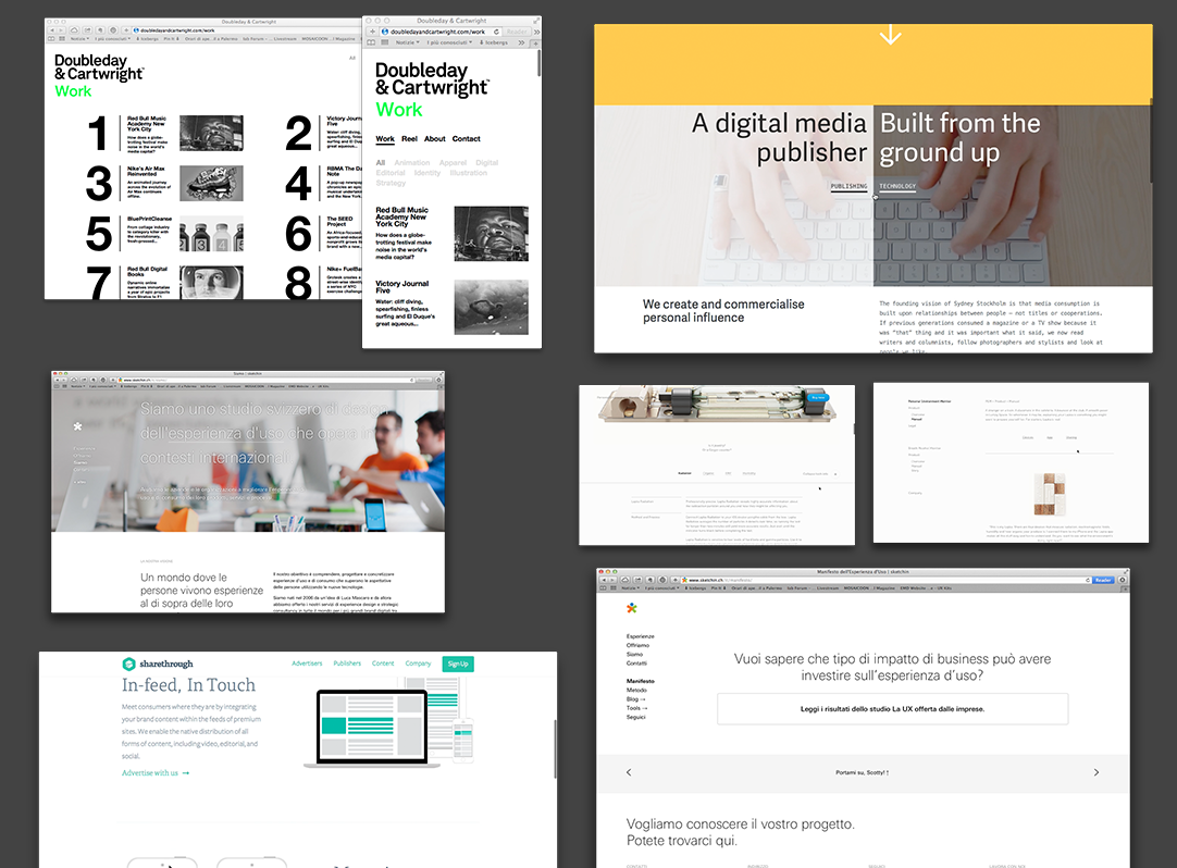
The previous site was mainly illustrated, had certainly done its job but visually did not let the technology-related aspects and the platform that was supporting the network shine through. It was therefore decided to take sites related to technology and the digital world as a reference.
