Context
CGT offers integrated sales, rental and service solutions in the Mining, Large Works, Infrastructure, Construction, Power Generation, Oil & Gas, and Marine Mechanics sectors.
What I did
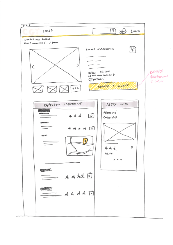
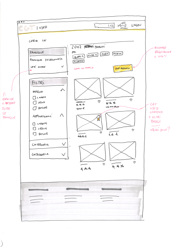
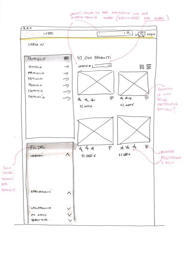
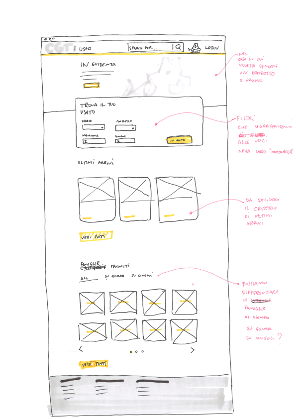
In this project, I was responsible for gathering requirements, defining the information architecture and UX of the search paths, proposing design solutions in the form of sketches and wireframes, and finally making all the Ui and mockups of the desktop and mobile versions.
Discover
How can the product search experience within the CGT site be improved?
Framing the problem
The users of this site are people who need to buy excavator vehicles and other transport and construction machinery and accessories.
The three search areas are buying new, renting and buying second-hand machines.
Define
Define information and functions
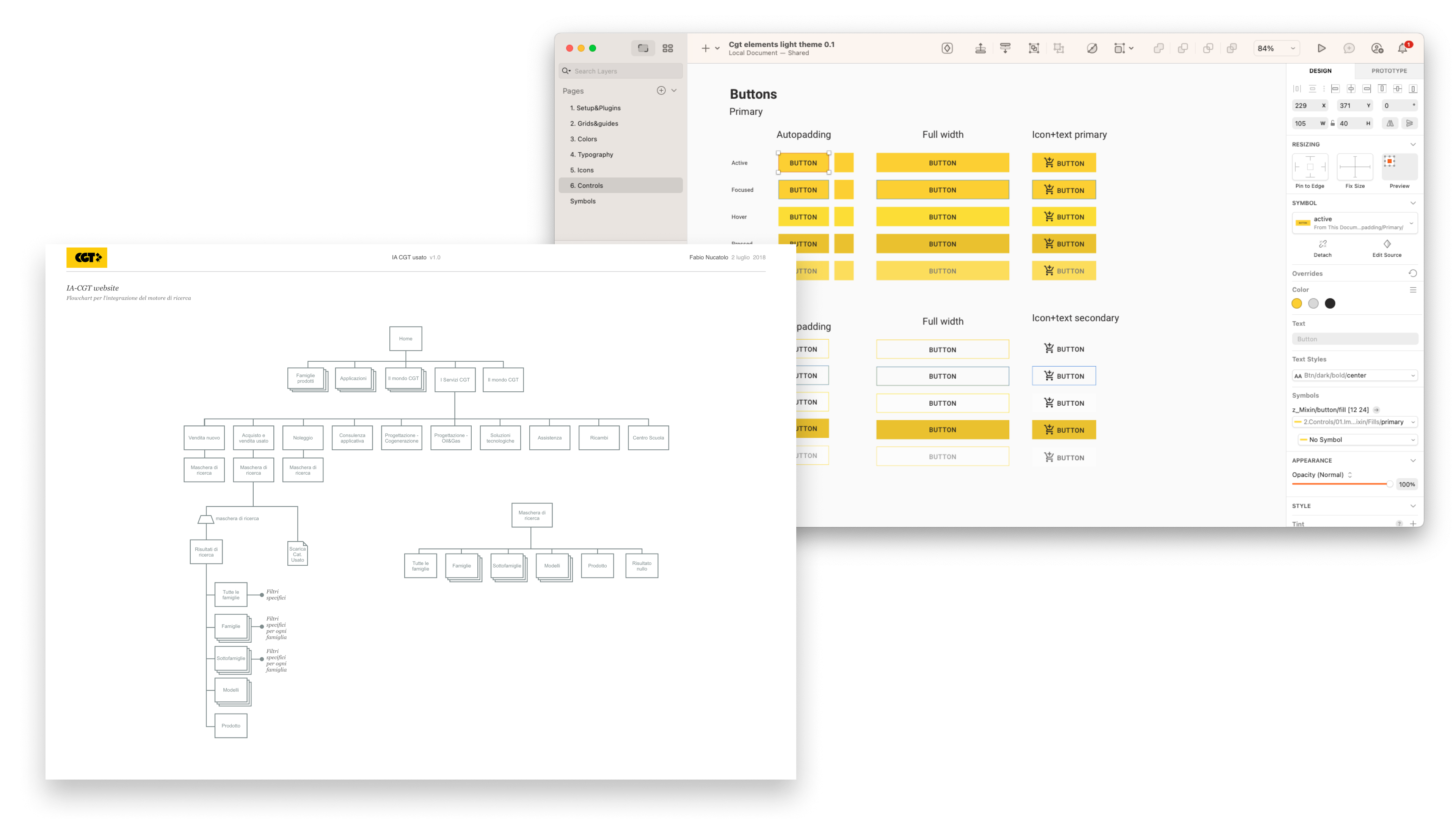
For the definition of information and functions, many meetings were held with flow proposals, wireframes and sketches. This led to the definition of a search flow designed on the basis of the needs of possible users. For this project, end users were not interviewed but we considered CGT interlocutors as subject matter experts.
Design
Two different perspectives
The creation of the UI was conducted from the then existing site. It was sufficient to create the basic interface components in sketches and then understand the logic of realising new and more complex elements.
For the UX, the work was done on a different scale, focusing on the overview and the happy paths that lead users to search for products and discover the products best suited to their needs.
Progressive disclosure
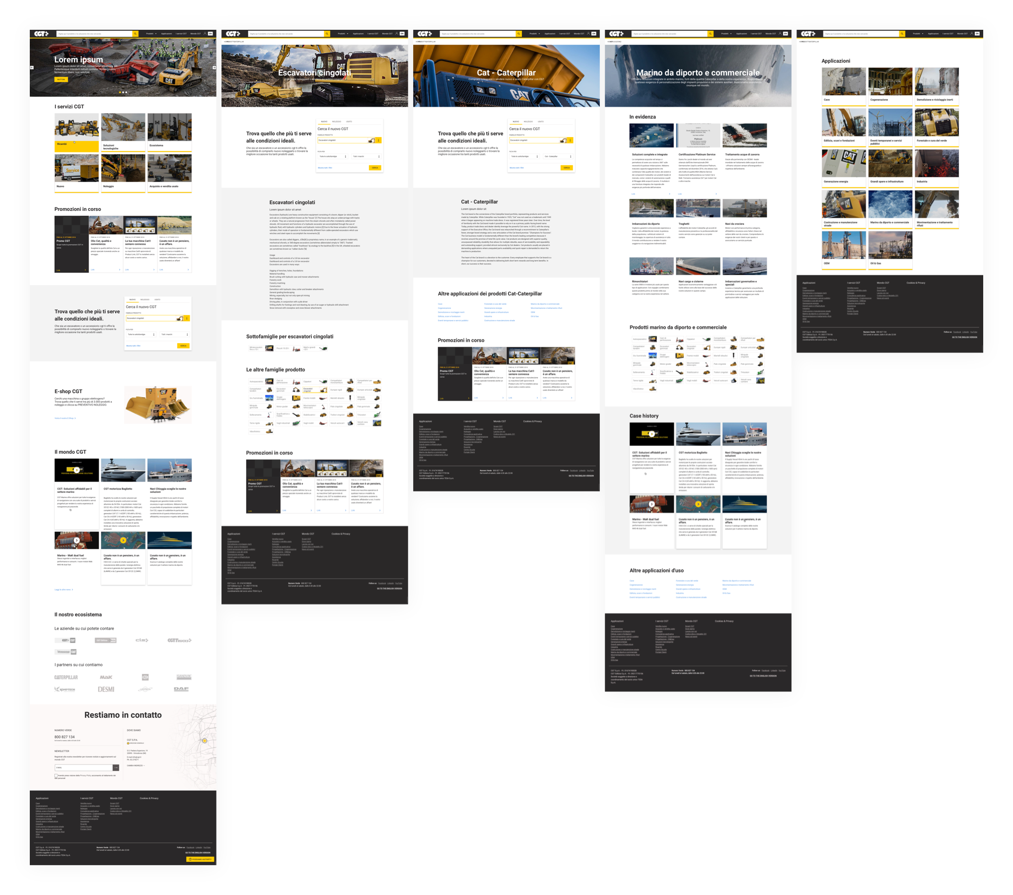
Not all users have a search key, so it is necessary to guide users in their search through navigation and page content. In this way they can get an idea of the product that best meets their needs.
This is why the Home, product family, brand, application and application-specific pages were designed.
Search results & tools
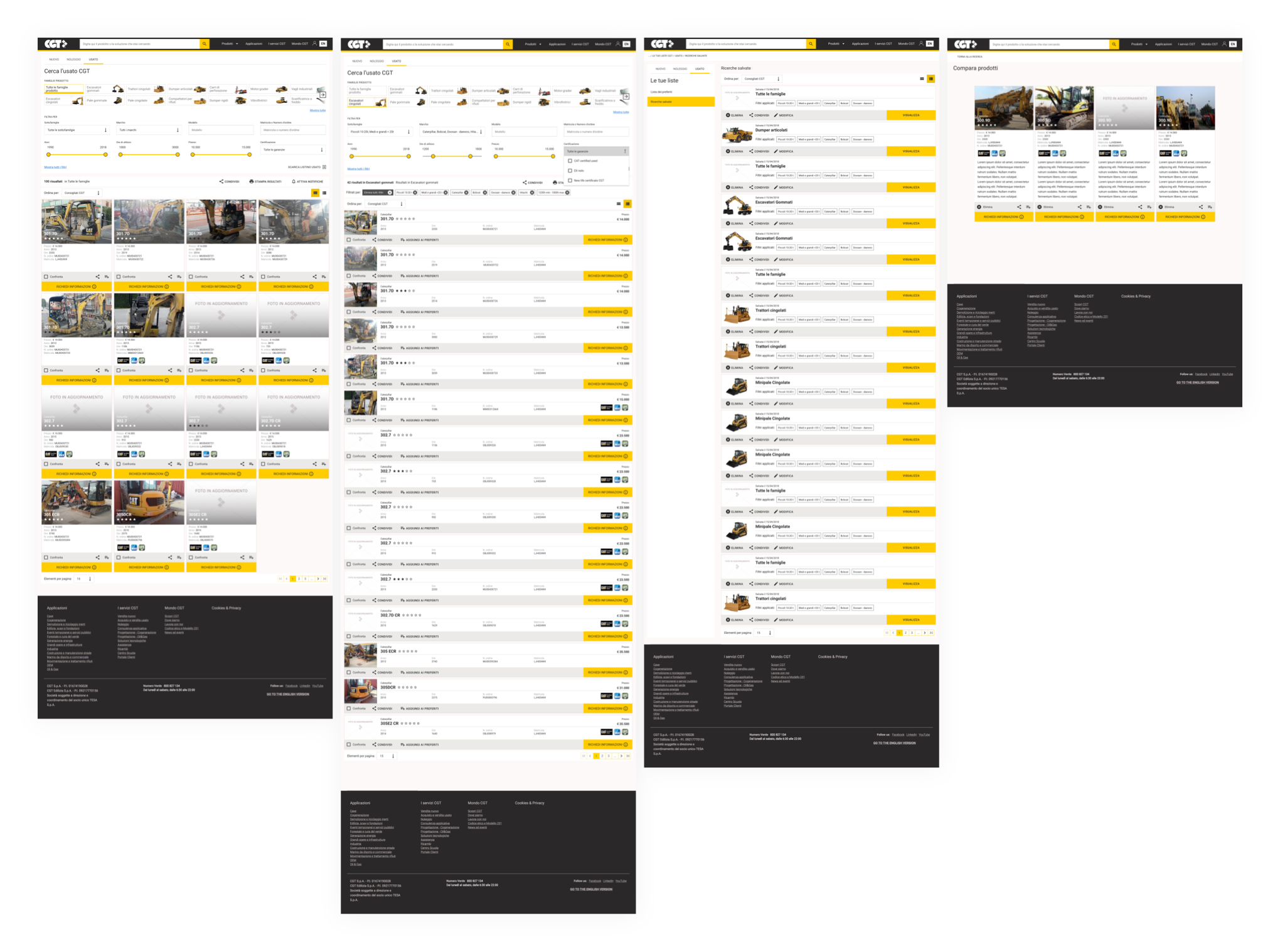
Once they understand their needs, users search for the vehicle that can meet them, this process is neither linear nor immediate.
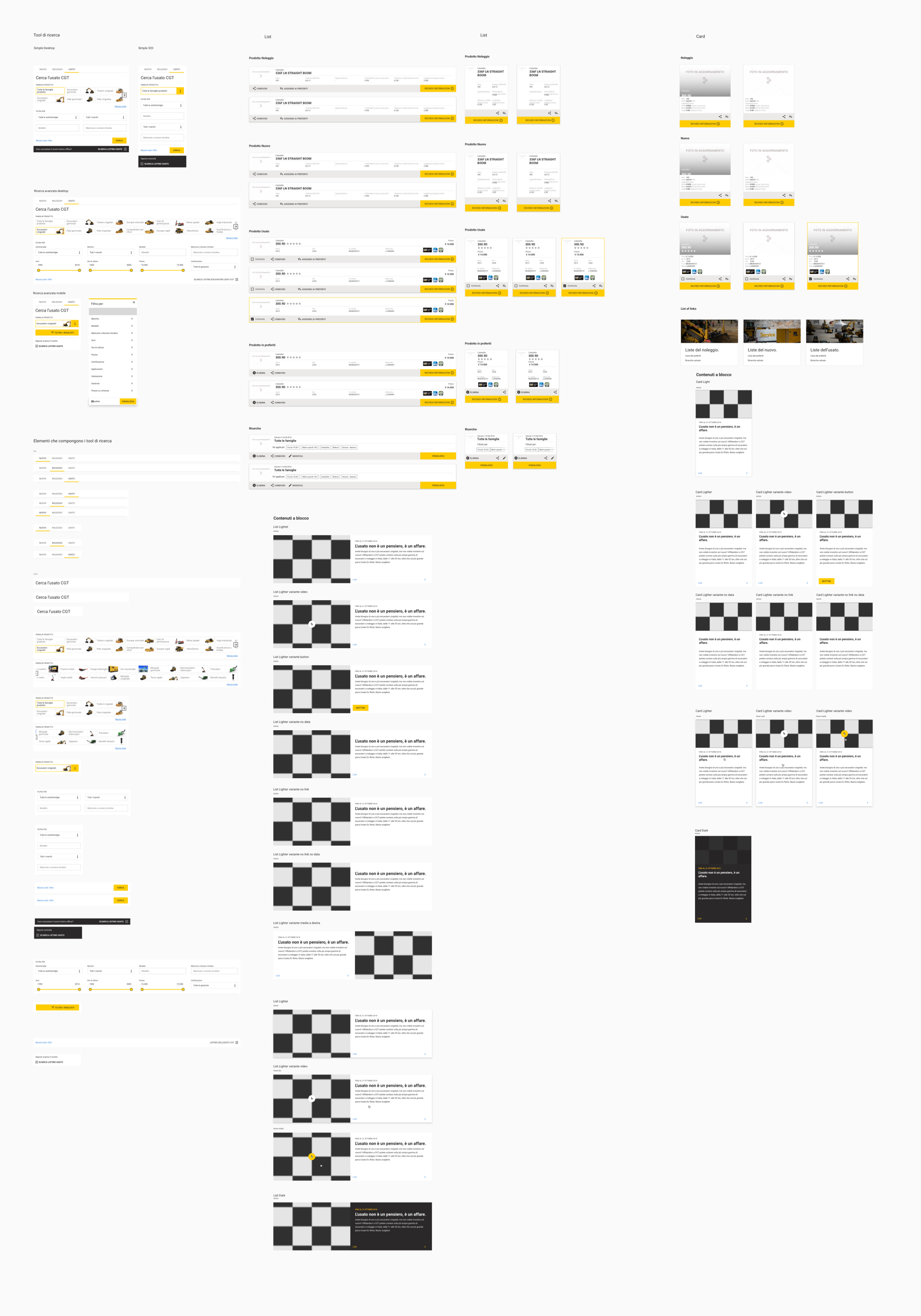
This is why, in addition to designing a search results page in dual display, list and card, I was also responsible for designing other useful search and comparison tools such as the creation and management of a list of favourite vehicles and the product comparison page.
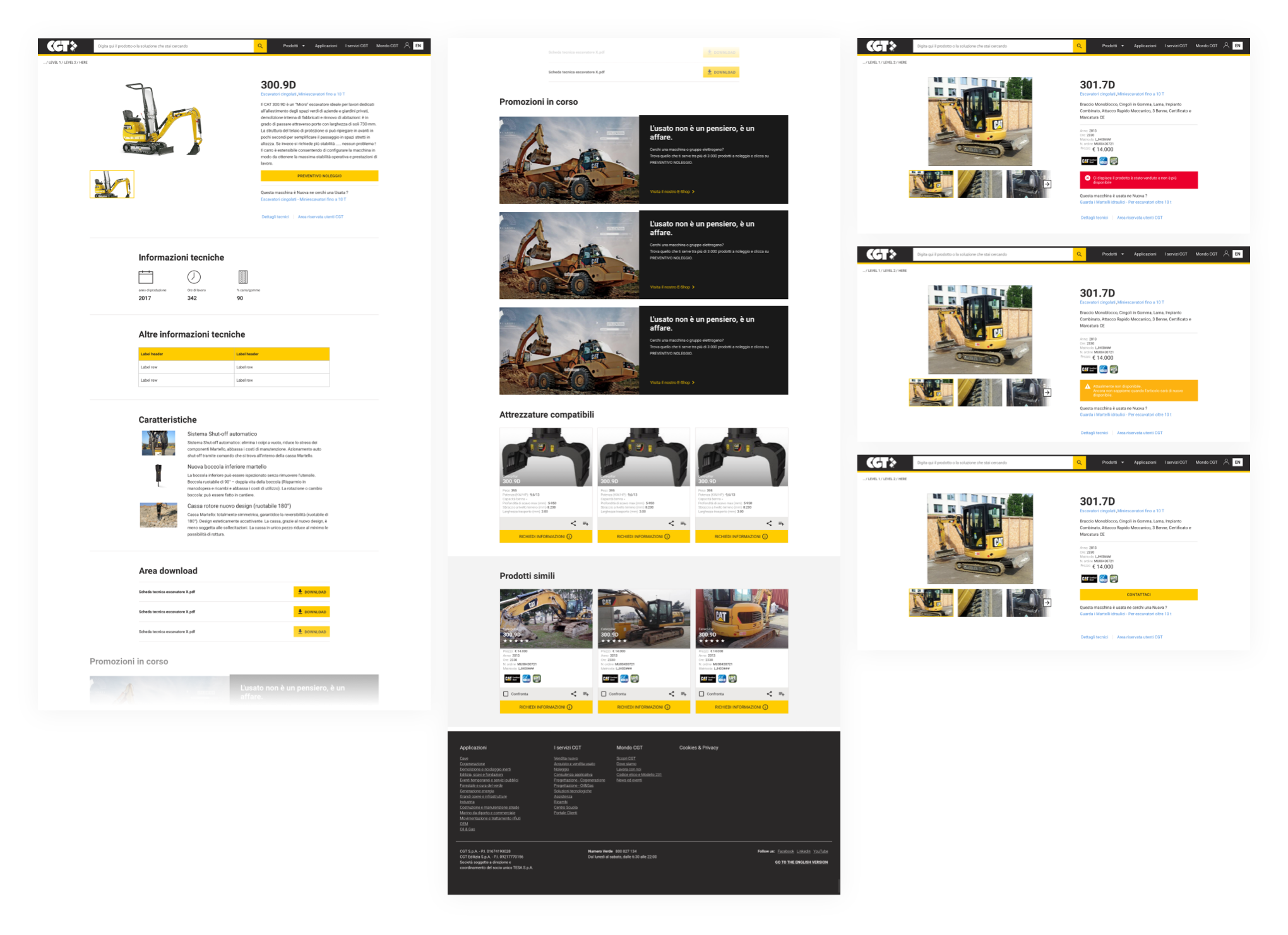
Product pages
Once they understand their needs, users search for the vehicle that can meet them, this process is neither linear nor immediate.
This is why, in addition to designing a search results page in dual display, list and card, I was also responsible for designing other useful search and comparison tools such as the creation and management of a list of favourite vehicles and the product comparison page.
Deliver
From components to content blocks
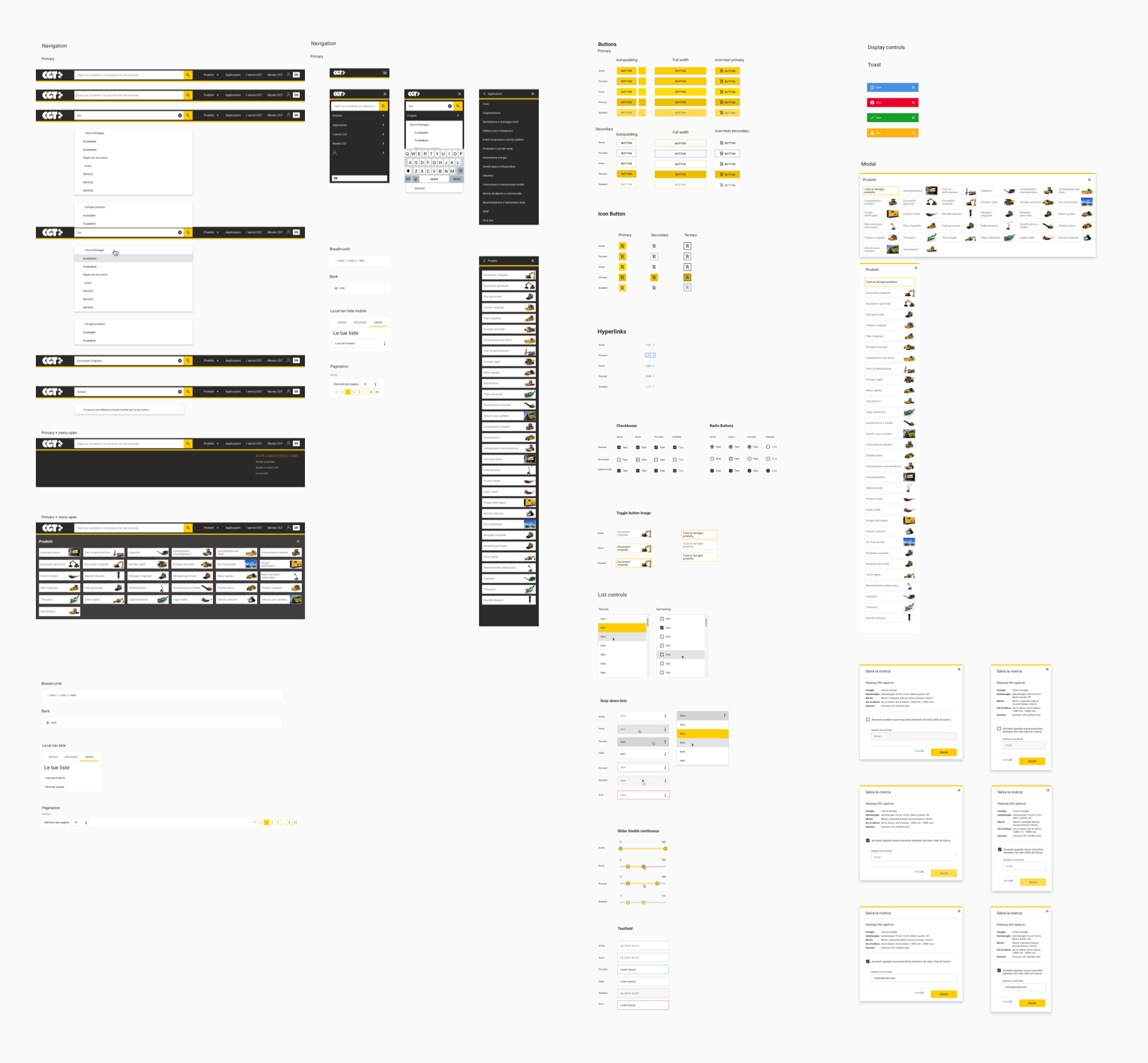
For this project, it was necessary to create both the basic interface components and the content blocks to be used within the pages of the site.
To realise this design system, I started from an unbranded design system, which I use as a template for the realisation of many design systems, in order to speed up work and reuse nomenclature, states, interactions, etc.
